Below you find a brief summary of projects I have worked on related to my fields of education, expertise and professional practice—in addition to some of my published writings about marketing and design.
Portfolio
Below you find a brief summary of projects I have worked on related to my fields of education, expertise and professional practice—in addition to some of my published writings about marketing and design.
-
GRAPHIC DESIGN
As a graphic designer, my most significant strength is the fact that I have experience from working in all disciplines—from branding to motion graphics, print- and digital, and for brands and organisations of all sizes.
Becoming a creative director—increasingly leading design work contrary to personably being responsible for designing individual assets—researching and writing about design also has become an essential part of my work.
Below is presented a brief selection of work- and writings relevant to my work with graphic design.

- Marketing Campaign
- Royal Opera House

- Logotype
- Cultural Communication Project

- Marshall
- Motion Graphics

- Customer Magazine
- Pernod Ricard International

- Adverts
- Jameson Whiskey
- Book Design
- Kahlúa International

- Pop Up Book
- Linotype LTD
— Writings —
-
DESIGN RESEARCH
Any design, regardless if it is a website, an advert, a magazine or a book, that in your eyes looks great; your best friend or parents might find unappealing or even ugly.
As a creative leader, I have found it increasingly interesting and important to build an understanding of how design is interpreted by and within cultures and distinct audience segments, which is imperative when creating design concepts and advertising campaigns that need to be liked and appreciated by the target audience.
Below is presented a design research project which I led between 2016 and 2019 and a selection of research articles relevant to this project.
— Writings —
-
-
PHOTOGRAPHY
Beginning my career as a photographer, I have shot adverts, portraits and products for international brands, agencies, magazines and books both in the studio and in the field.
While I no longer photograph professionally, having a background as a photographer is a great strength when developing campaign concepts, as it allows me to test, illustrate, and present ideas for stakeholders, the marketing team, and the photographer selected for the project. This not only saves time—but more importantly—helps avoid common misinterpretations when photographers do their best in translating written briefs which sometimes can lead to unexpected results.
As photographing comps is a vital part of campaign development, I also emphasize that every organization with an in-house agency should establish an in-house photo studio.
Below is presented a breif selection of photographs I have shot for brands, organisations, and magazines.

- Nonstop Fitness
- Campaign photography

- Swedish Chefs Association
- Campaign photography

- Pernod Ricard International
- Product Photography

- Piolets d'Or
- Campaign photography

- Alexander Osterwalder
- Campaign photography

- Jameson Whiskey
- Campaign Photography

- Fighter Magazine
- Editorial photography
- MUMM Champagne
- Advetorial photography
-
PROGRAMMING
Digital campaign assets (banners, landing pages, websites, apps etc.) have become an intricate part of almost every advertisement campaign. Consequently, to work as a marketer, graphic designer, or creative leader in today's digital marketing landscape, it has become imperative to have at least basic competence in HTML, CSS and JavaScript.
As a creative director, being able to read code delivered by the teams and agencies you work with is even more important, as if you do not have the skills to do so, you are not in the position to assess whether the work they deliver is inline with the brief or not. In addition; lacking these skills, you also will not be able to work efficiently with analytics platforms and, even less, to work alongside your development teams when guiding work.
Another significant importance of being able to read and write web code as a creative leader is to have the ability to understand technology stacks proposed by external agencies and freelancers and whether what they suggest is a solution best adapted to the project from a technical, economic, and resource-demanding standpoint—or if they have proposed a certain technology based on what is most economical or suitable for them which, unfortunately, often is the case.
In addition to having a professional webmaster diploma and a Graduate Certificate from Harvard in Web Development, I also have developed websites and apps for over twenty years, and am proficient in all the major web languages and content management systems.
Below are presented a few notable projects I have worked with, in addition to some of my published writings about app- and web development.
Please note that these projects only represent a fraction of all web projects I have worked with and only are meant to be an illustration of my skills as a programmer. I, for example, have done countless projects over the last twenty years based on templates in WordPress and Bootstrap, but presenting projects based on templates is not relevant when presenting my programming skills, as doing so would basically be the same as presenting someone else's work as mine.
Further, I also have not cared to display any projects from the outset of my career, as they are now more than twenty years old and outdated in both the design and structure of code.

- Nonstop Fitness
- App prototype
- Framer

- Simplicity
- Software Development
- JavaScript, PHP, HTML5
- Artgazette.com
- Web Design

- SUP
- App design
— Writings —
-
PACKAGE DESIGN
While my greatest strength as a graphic designer is not package design, I have designed several projects with packaging for products targeting international markets; three projects of which are presented below:
-
MARKETING
Graphic Design is about converting marketing messages and strategies into visual communication assets, such as adverts, logos, books, magazines, apps and websites.
As all graphic design assets regardless of dicipline (branding, web, print, animation etc.) are grounded in a marketing message usually defined by a marketing team; graphic designers, in addition to being skilled creatives, also need to be competent marketers.
In addition to being a prolific writer about marketing, I also have a masters in digital marketing from the University Of Aberdeen.
Below you find some of my published writings about marketing.
-
-
EDITORIAL
There is a distinct and critical difference between copy composed by writers with an educational- and professional background in journalism; compared to those with a background from advertising agencies and degrees from marketing schools.
Both have their place in the development of campaign assets, but what most marketers, advertising- and in-house agencies fail to understand is how detrimental marketing copy is to editorial assets such as press releases, or why most copy in adverts written by journalists fails. In short, journalism is about creating stories, while copywriting is the art of composing sales- and marketing messages with a distinct goal. Very few writers are good at both, and having a copywriter responsible for creating editorial assets such as press-releases, often will be as detrimental as when journalists write copy for sales adverts.
Having been the publisher and editor-in-chief for several magazines—in addition to almost two decades of experience in advertising—I have built a wide network of some of the world's best copywriters and journalists. But more importantly, I also have the experience of leading editorial processes involving large teams of journalists, copywriters, editors, and translators on multiple markets simultaneously.
Below are links to some of the magazines where I have been the publisher and editor-in-chief.
-
BUSINESS EXPERIENCE
In addition to having led the work of several magazines (previous section), I, early in my career, also founded krogfoto; a Swedish photo agency working with all major advertising agencies in Scandinavia. In the last ten years, I also have written extensively about innovation, leadership, and organisational change.
Below you find a link to an archived version of Krogfotos website, and some of my published articles about innovation and organisational change.

- Advertising Agency
- Krogfoto
— Writings —
-
PROJECT MANAGEMENT
Solid project management processes are imperative when leading the production of campaign work with team members, freelancers, and agencies often dispersed in many different locations and time-zones. With the increasing complexity of campaign content which often ranges from the production of adverts for TV and Radio to the development of websites, landing pages, banners, apps, photography, and editorial content; there also is no one-size-fits-all methodology of project management.
As an example, development teams often work in Agile processes and Scrum, while marketers och project managers in agencies usually prefer CPM, PERT, or similar strategies grounded in Waterfall. As the creative leader, I am the intermediate of all teams, and as such often need to lead, aggregate and report on work managed in several project management methodologies and platforms. To do so efficiently, I have worked hard to become proficient in both the Agile and Waterfall paradigms.
Below you find some of my published writings about project management.
-


Nonstop Fitness
Campaign Photography.
2013 I became the Creative Director for Nonstop Fitness, the Swiss fitness chain. Here I currently hold the position as the company's 'senior advisor for creative strategies.'
While my primary responsibility pertains to planning, building and executing the creative strategies that helped grow the company into one of Switzerland's most profitable fitness companies, I also have photographed many of our most successful campaigns.


Marshall Guitar Amplifiers
Animated campaign logotype.
Marshall Amplification is a British company that designs and manufactures music amplifiers, speaker cabinets, headphones and earphones. It is one of the world’s most iconic brands, loved by artists all over the world since the 1960s.
Marshall’s guitar amplifiers are among the most recognized in the world with a signature sound characterized by sizzling distortion and “crunch,” which was conceived by Marshall after guitarists Pete Townshend, visited Marshall’s drum shop complaining that the guitar amplifiers then on the market didn’t have the right sound or enough volume.
To be utilized for their digital campaigning, Marshall needed a short motion graphic of their logotype that would be easily implemented on a wide range of campaign assets, including websites, banners, and outdoor media.
This nine-second motion graphic I created for them in 2015 is still used by the company today.
Royal Opera House
Creative Direction and Art Direction
The Royal Opera House is one of the world’s leading opera companies.
Based in the iconic Covent Garden theatre, it is renowned both for its outstanding performances of traditional opera and for commissioning new works by today's leading opera composers.
Like many of the world's leading ballet houses, the Royal Opera Ballet finds their audience not as diverse as the population as a whole and that, in particular, young people are underrepresented among their visitors. Engaging more young visitors is vital — not only to ensure the long-term survival of the Royal Opera — but even more importantly, to ensure the survival of ballet as a prospering art form.
With the goal of dispelling the preconceptions about ballet and encouraging a young, culturally engaged audience between twenty to thirty to try ballet for the first time, I was invited to create a new concept- and marketing strategy that would help them achieve this goal.
In addition to developing the thematics of the campaign, I also ended up designing, photographing and programming most campaign assets, of which some are presented below:
Based on in-depth conceptual research the campaign concept was built around the idea of inviting thought leaders in the domains of music, art, film and fashion to produce a ballet performance under the banner of C/O Royal Opera House.
While each guest producer would be given almost free hands in executing their performances, they had to frame their work in one of the following themes: "Love", "Passion", "Serenity", and "Lost".
My deliverables which are presented below include: campaign concept and thematics; print and digital adverts; campaign website; extensive functional- and usability testing, and a campaign portal with all assets of the campaign easily accessible to all members of the Royal Opera's marketing team:
Simplicity
Software Development.
Simplicity is my “pet project”, which I have been working on for the last two years.
While I am not a developer, a big part of my job as an Art Director was about developing digital assets, and as such, I have worked hard to become a proficient developer in all the big web languages.
While I, in my current roles as Creative Director and ‘Senior Advisor for Creative Strategies, is not expected to code websites, being able to read and write code is a significant asset when working with developers. Not only does this enable me to understand what they actually are delivering, but I also have the ability to assess the quality of the code they write.
#Welcome to Simplicty
With the premise of shortening web-development time and simplifying web design, I have seen first-hand in my role as a creative leader how the popularity of development frameworks such as Bootstrap, WordPress and Foundation has grown exponentially over the last decade. This, sadly, has resulted in many young developers entering the market today lacking the ability to code even a basic website without using a framework.
A significant problem pertinent to all major frameworks is that the code they generate is non-semantic, bloated and only partly follows coding standards.
Besides generating inefficient code, all leading frameworks also come with thousands of lines of overhead code, which has a negative impact on page loading time and hurts the user experience with lost revenues, user engagement and customer trust as a result. In addition, all leading frameworks also have increasingly steep learning curves, and users of these frameworks, to work with them efficiently, will have to learn an almost new coding language.
Simplicity is different. Sites built with the framework will have an efficient and semantic codebase following the latest coding standards and will not force visitors to download any unused overhead code! The framework also is built with the aim that anyone with a basic knowledge of HTML and CSS should be up and running within ten minutes or less, and users do not have to learn any platform-specific code.
As noted above, Simplicity is my “pet project”, which I mainly work on as I love to code and to keep my coding skills up-to-date. I have no ambition, however, to work full-time on this project.
Below is a link to the current version of Simplicity, where also a number of videos presenting the project rationale and the main functionality are published:
https://pre-alpha.getsimplicity.app

The Cultural Communication Project
Design Research Project
While several cultural frameworks exists, including Hofstede’s Cultural Dimensions, The Lewis Model, and Trompenaars's model of National Culture Differences provide designers with broad guidelines for visual preferences of cultural dimensions, no empirically validated general model of design yet exists which gives explicit design guidelines mapped to cultural dimensions and variables including content hierarchy, information density, typography, image framing and colours. Such a model would enable designers and marketers to create significantly more efficient communication strategies and assets, and would leverage marketing efforts between organisations with little or no means to perform advanced market research and big-data analytics—to those with multi-million budgets for a systematic collection and interpretation of audience data.
The cultural communication project is an attempt to build such a model by exploring how cultural dimensions defined by a validated cultural framework experience explicit design parameters. This model will help designers and marketers to understand better how culturally diverse audience segments perceive design, and will inform designers on how to create design assets which communicate more efficiently to these segments.
The Cultural Communication Project is an ongoing design research project which I initiated as part of my master's in Digital Communication at the University of Hertfordshire, and I currently work with Dr Hongming Wang at Harvard University to publish the research.
Below are two video presentations I have created for the project and one of my research articles discussing how cultures differ in their perception of web design.


Educational Design
Traditional student literature on typography does not enable learners to analyse typefaces side-by-side, which is essential when learning about the intricate parts of different typefaces.
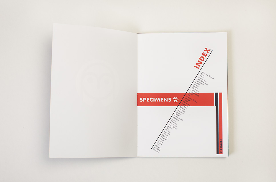
To solve this problem, I, for a few years have worked on developing a new type of educational system of typography where type specimens are presented on movable cards, which makes it easy to compare sometimes almost invisible distinctions between typefaces from the same class.
The Typedia system is presented below. A complete presentation can be downloaded here »


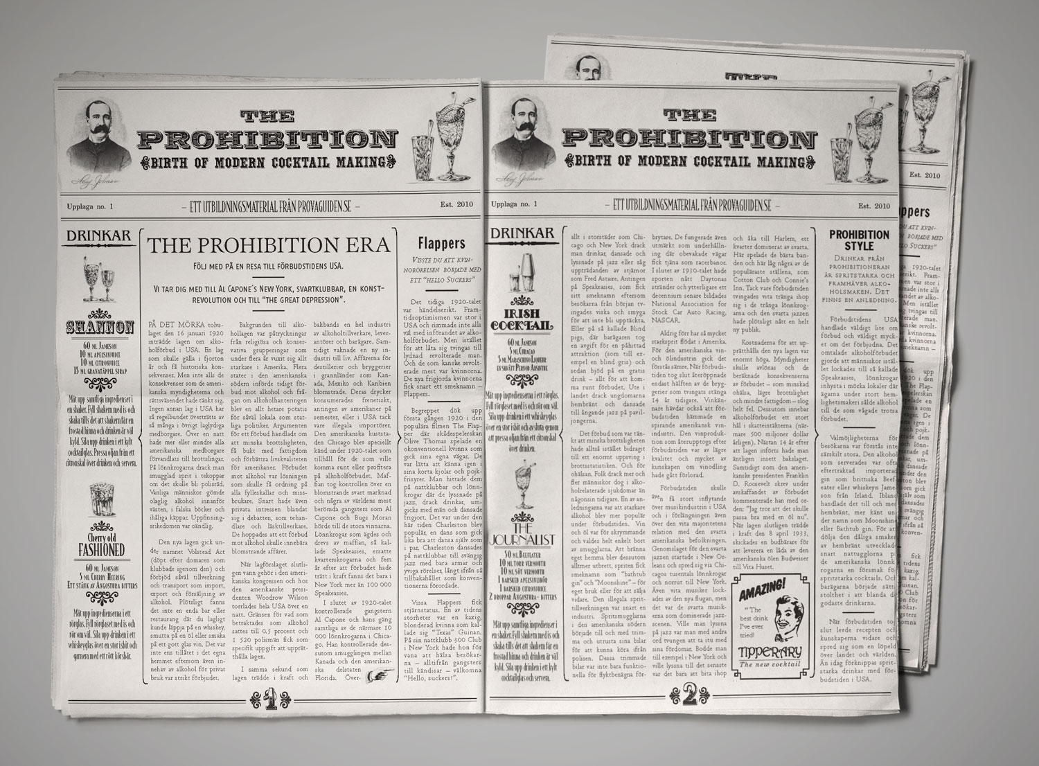
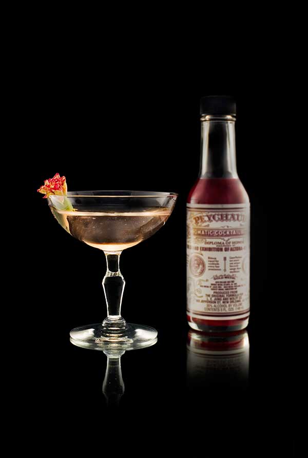
Customer Magazine
Pernod Ricard International
For distribution in bars all around the world, Pernod Ricard International wanted an engaging magazine to tell the story of the prohibition era and to promote classic cocktails.
An in-depth study of newspapers published between 1890 and 1935 resulted in a final design with a 1930s look, and to incorporate drink recipes, I also designed ten different adverts with a design grounded in the Epoque of the Prohibition era:

Art Direction
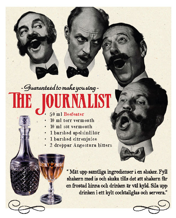
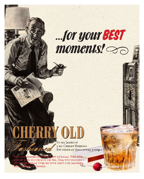
Jameson Whiskey
To market classic cocktails Pernod Ricard International needed a range of adverts to be run in newspapers and magazines all around the world, which I was commissioned to design.
Studying the graphic language of adverts from the 1920s and the prohibition era, I ended up designing seven different adverts with a design grounded in this era:


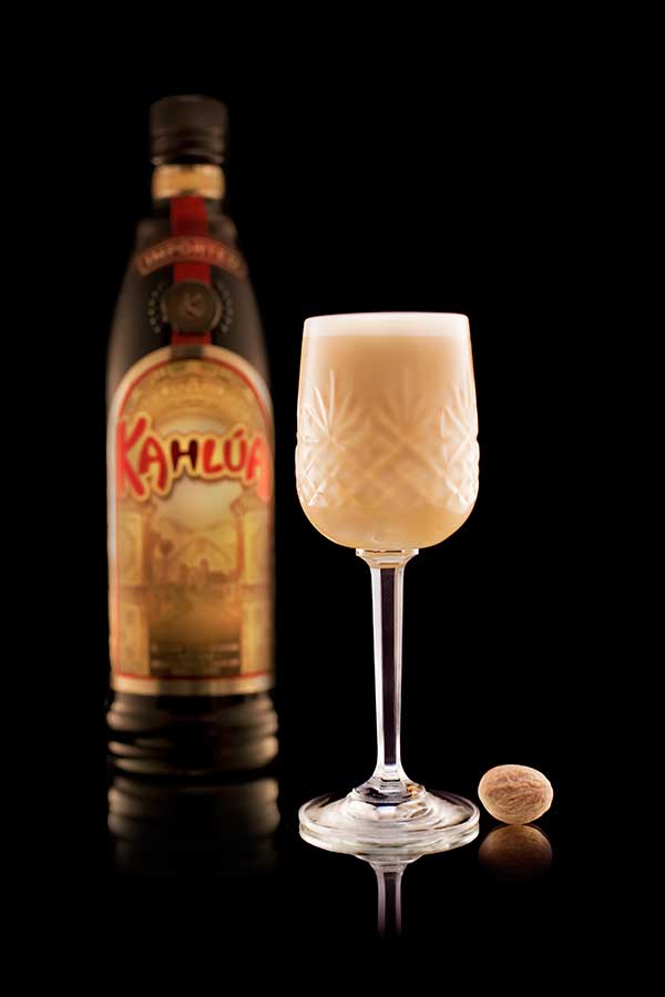
Book Production
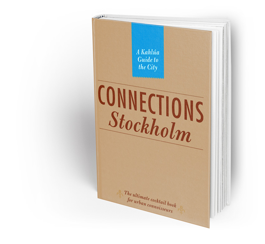
Kahlua International
Kahlúa is one of the world's most famous liqueur brands that you'll find in almost any bar, anywhere in the world.
Two of the main troubles for the brand are that very few new Kahlúa-based cocktails have been invented in the last thirty years and a perception of the brand as a bit "boring". In 2010, Kahlúa decided to start an extensive re-branding process which I was invited to lead.
To promote new Kahlúa cocktails and to reposition the brand as "young", "global", and "trendy," I also was commissioned to design- and produce a series of guidebooks to the world's trendiest cities with engaging articles about fashion, restaurants and nightlife.
Read a digital copy here »
Package Design
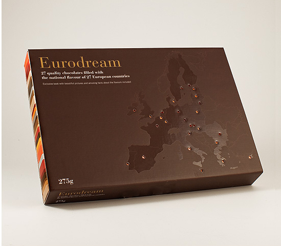
European Regional Development Fund (ERDF)
The 'European Regional Development Fund (ERDF)' was founded to stimulate the economic growth of its members. To educate EU policymakers about gastronomic traditions in the union, the fund 2008 launched an initiative called 'Eurodream' for which I had the design lead.
One part of my job was to design a chocolate box where the taste of the truffles would be represented by the national flavour of each member state. The brief also stated that its cover had to include the map of Europe and that each truffle had to be clearly identifiable so there would be no doubt as to which country it represented. Furthermore, the designs of the truffles also had to be simple to keep production costs down, and each box also was to contain a booklet explaining the story behind the national flavours that could not fall out when moving the box.
With all this in mind, I designed a box with no lid and where you slide the part containing the truffles in from the side. This meant not only a cheaper production cost, but also that the box could be opened and closed with no risk of the book or the truffles falling out.
As always, when working with design for large organisations and numerous stakeholders, the biggest challenge with Eurodream was to create a design that all stakeholders could agree with.


Paper Engineering and Book Design
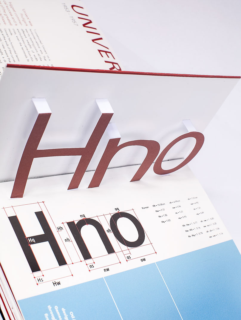
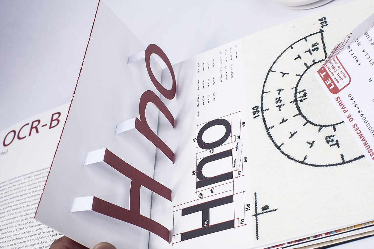
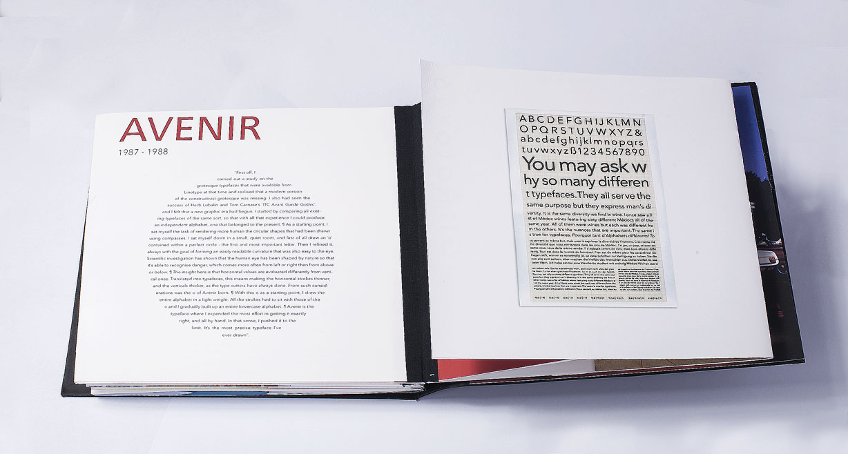
Linotype LTD
With a career lasting almost fifty years, Adrian Frutiger is one of our time's most influential type designers.
Almost anyone who owns a computer has one or more of his typefaces installed, and even though most people don't know him by name, we get influenced by his work every day by reading magazines, surfing the web or finding our way on the subway.
In my work as an art director, Frutiger's typefaces have become something of a bread-and-butter in my designs. His typefaces are not only beautiful, but they are also extremely well made and often have large font families making them an excellent choice when designing work with complicated hierarchies like magazines, brochures or annual reports.
To celebrate Adrian's work Linotype, one of the world's largest type foundries, decided to publish a book about his life and work.
Having been fascinated by pop-up books since I was a child but never gotten the opportunity to learn the trade or being offered to work on a paper-engineering project, I decided to design the book as a 'pop-up' that would allow the reader to study Frutigers most important typefaces in 3D.


Web Design
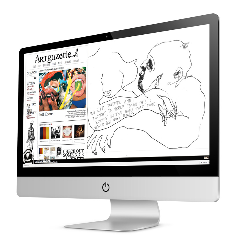
Artgazette.com
A major problem for small art galleries is finding ways of selling and marketing their art to buyers on the international market. Artgazette.com wanted to solve this by offering a platform where art galleries would be able to sell art and promote exhibitions to buyers all around the world. They also aimed to build the world’s largest database of contemporary artists, where the artists themselves would be able to sell their work directly to buyers without an intermediary.
As the creative director and senior designer, I was also responsible for designing the website, and my goal was to create a playful design grounded in the art sold on the site.


App Design
SUP
According to Richard Branson SUP was: "UK's hottest new social app to alert you when a friend is around".
The app had massive initial growth and received lots of excellent press all around the globe. In 2015 I created a growth strategy for the app grounded in forming partnerships with large community networks, music festivals and sports events. As part of this strategy, I also developed a new design for the app.

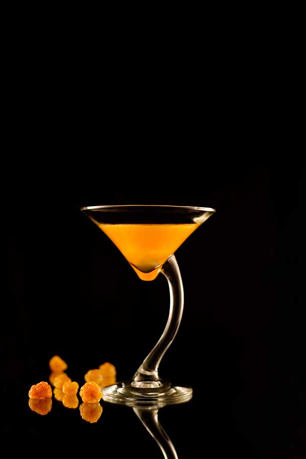
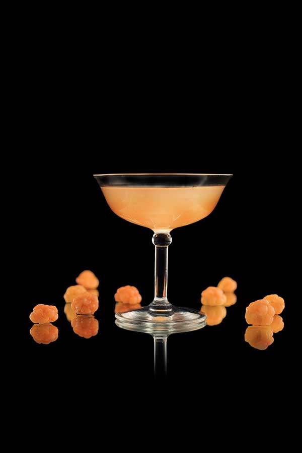
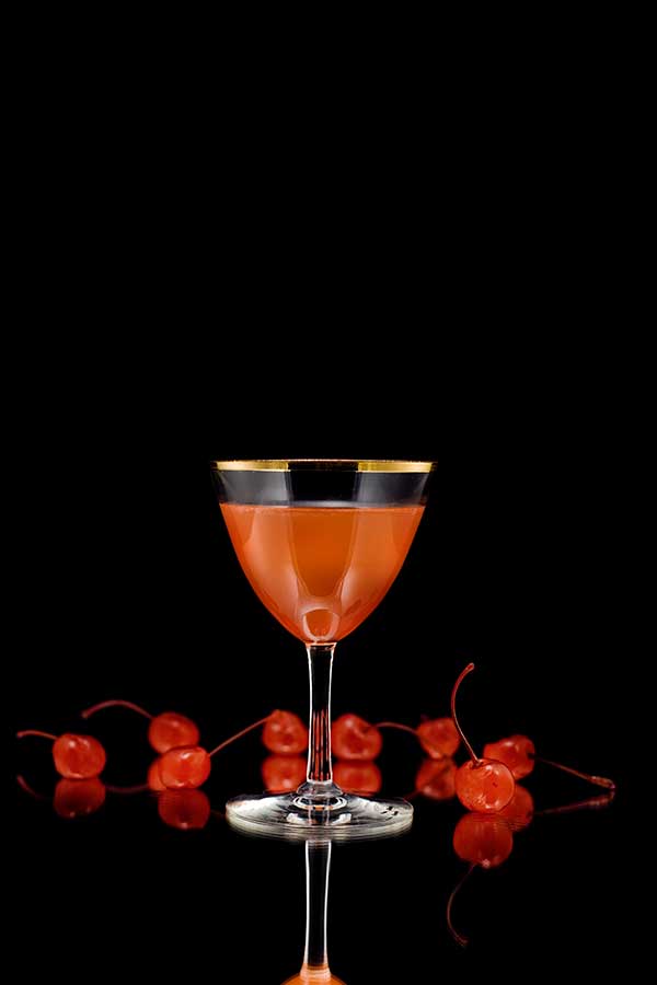
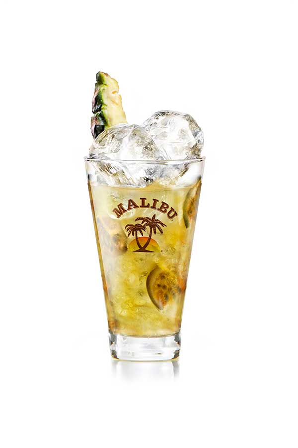
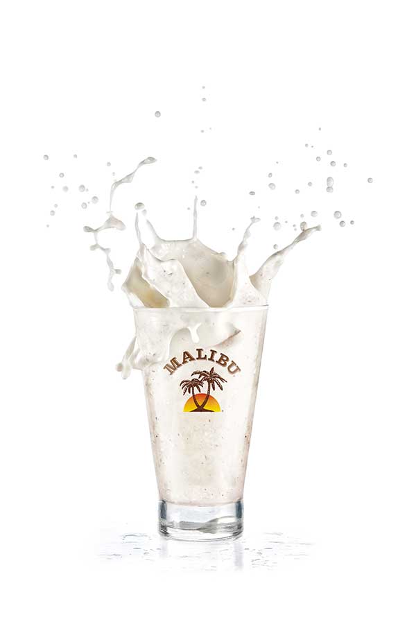
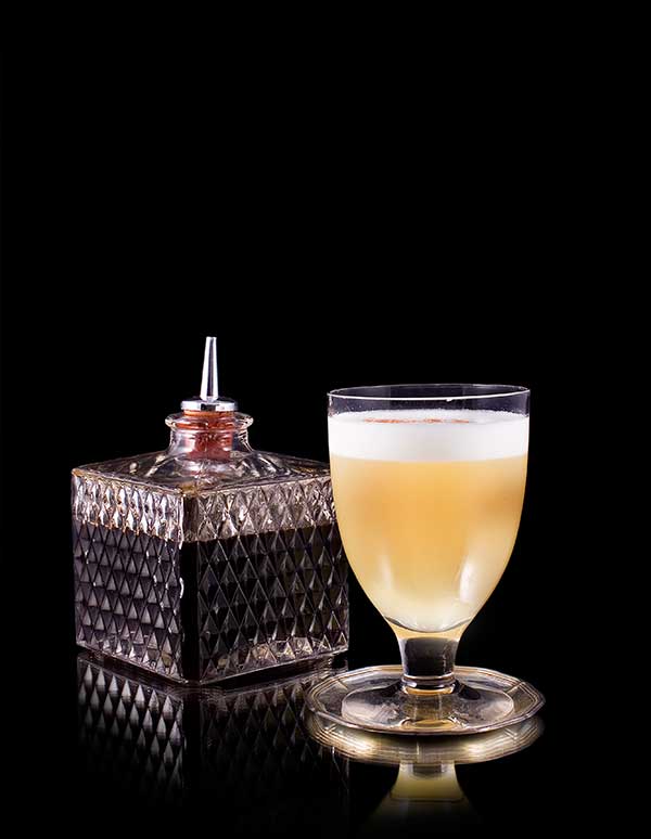
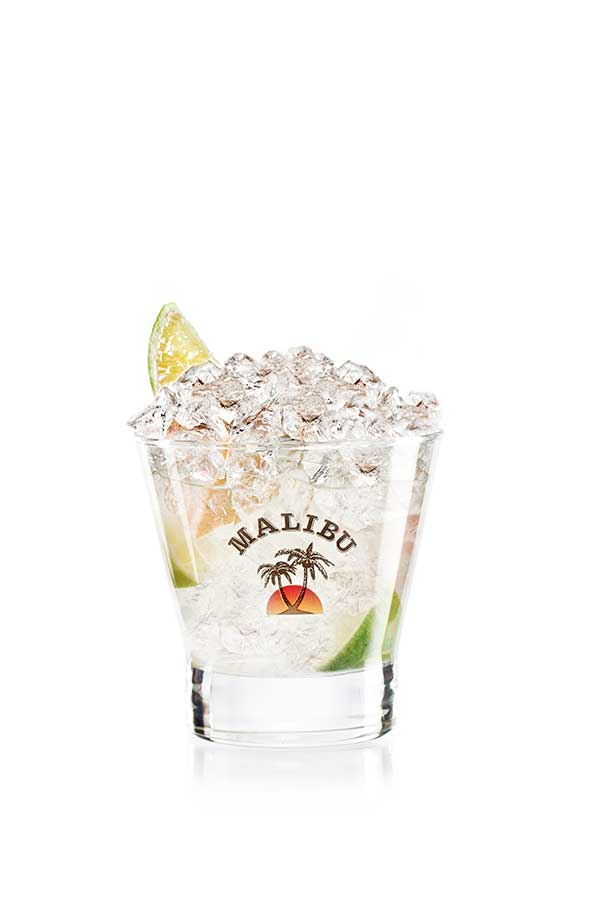
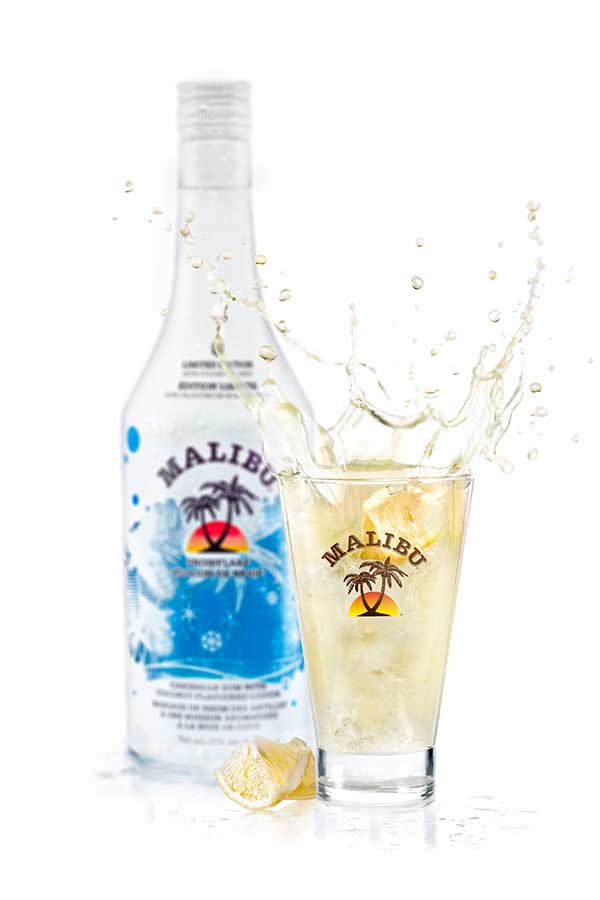
Product Photography
Malibu Rum, Kahlua, Absolut Vodka, Jameson Whiskey etc.
For more than half a decade, before deciding that I did not want to build a career as a photographer, I shot adverts and products for the world's largest spirits brands.
Below are examples of product shots and a behind-the-scenes from my work with the re-launch of Malibu Rum and Kahlua in 2005.

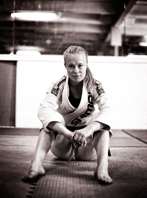
Photography
Swedish National Culinary team
Below is presented some of the photos I have shot for the Swedish National Culinary team.
The brief for this particular photoshoot stated that they wanted the photos to be "unconventional and fun."


Photography
Poster | Piolets d'Or
Piolets d'Or is the world's most prestigious alpinist award given to alpinists that have shown extraordinary bravery and a sense of exploration in climbing the world's greatest mountain ranges.
As part of the 2015 awards, I was asked to shoot a portrait of Christian Trommsdorff, president of Piolets d'Or, to be used for posters.
My main objective when photographing Christian was to create a beautiful portrait that would illustrate his love for the mountains and his vast experience working as a mountain guide.
Photography
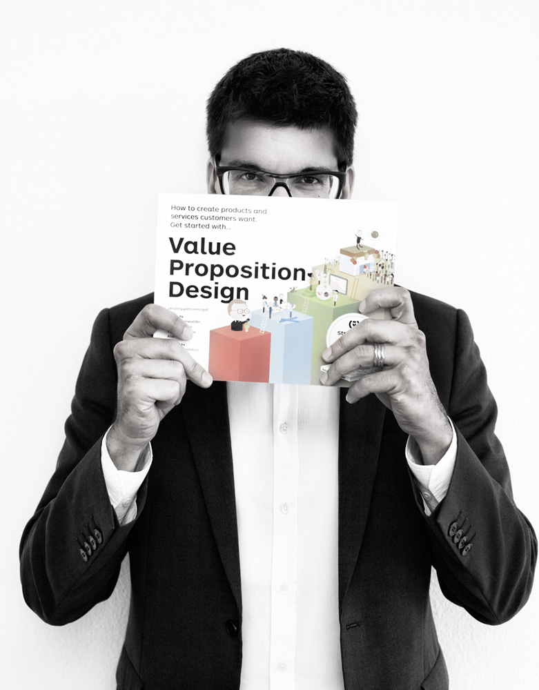
Alexander Osterwalder
Alexander Osterwalder is the inventor of the Business Model Canvas and the author of Business Model Generation sold in more than a million copies and translated into 30 languages.
For his new book; Value Proposition Design, I shoot a range of portraits to be used for press material and marketing. My goal with the portraits was to draw focus on the book and its title and to make the viewer curious about the author.

Advertising Campaign
Jameson Whiskey.
Jameson Whiskey is one of the world's leading whiskey brands, for which I have photographed multiple campaigns.
2010 I got commissioned to shoot a range of images to be used in adverts where Jameson was looking to reconnect to its roots. The photographs I shoot have a strong connotation of the '1930's Speakeasy' with a modern touch, and they came to be used by Jameson — not only in adverts — but also in cocktail books and a range of different print media.


Editorital Photography
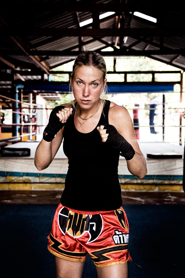
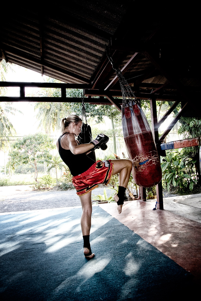
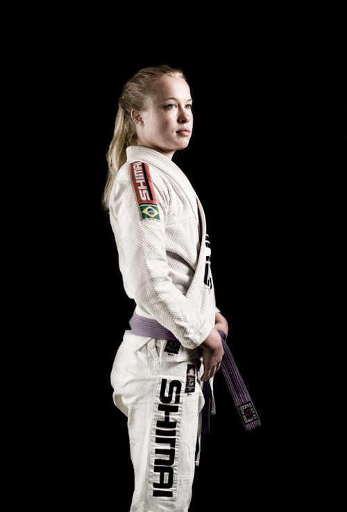
Fighter Magazine
Fighter Magazine is the world's leading publication about modern martial arts.
Below are portraits of some of the world's best female fighters, which I shot in Thailand and Stockholm in 2004 and 2005.


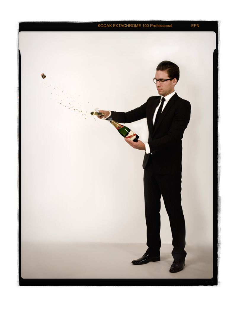
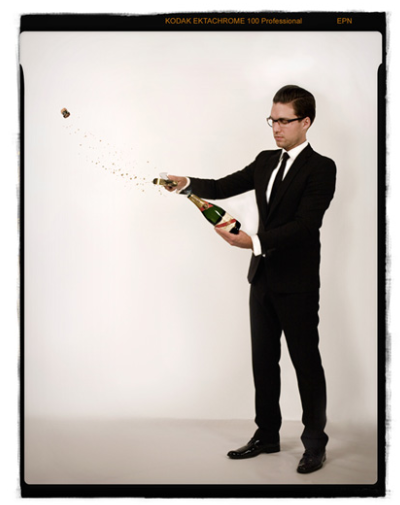
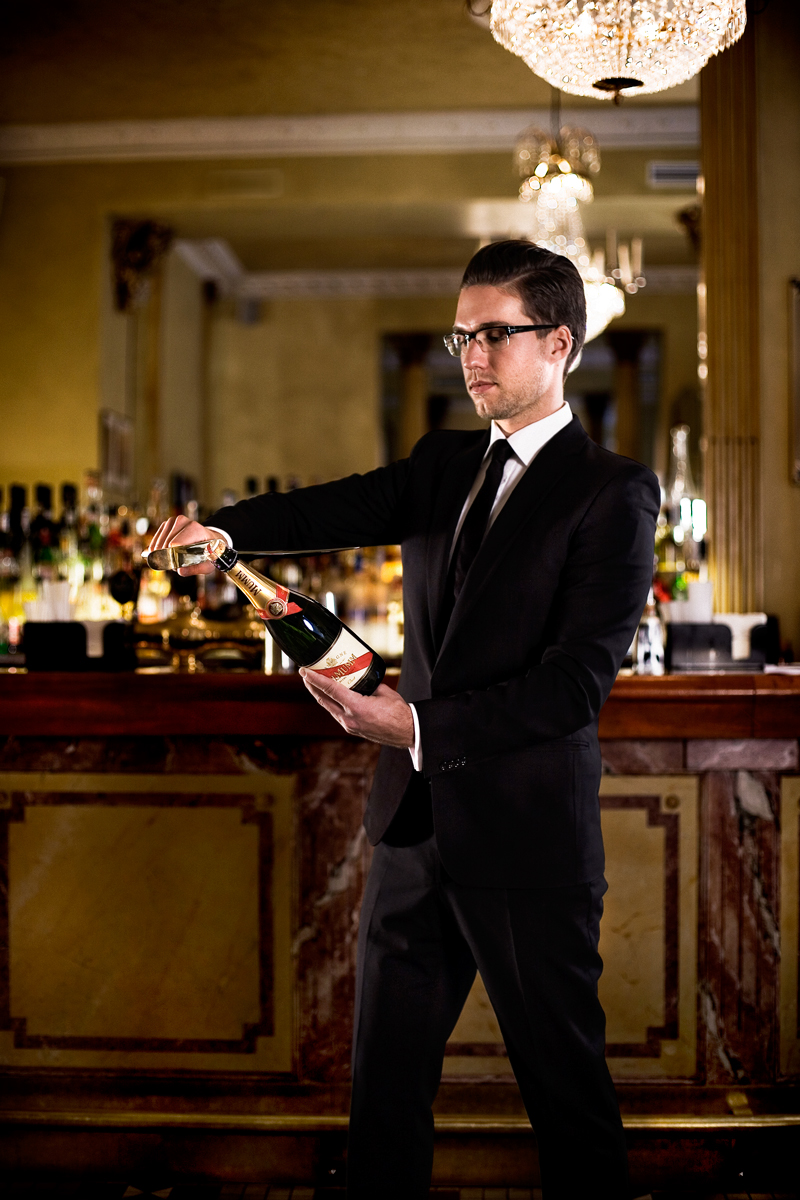
Advertorial
Mumm Champagne
G. H. Mumm & Cie is one of the world's largest producers of Champagne, currently ranked 4th globally.
2005 I shot a range of public relations photographs that were used to promote that year's celebration of the 'new year' were Mumm told the story and the technique used for opening a champagne bottle with a sabre.


Logotype
Voofii.com
The main requirement for the Voofii logotype was a versatile two-tone design, clearly communicating that Voofii was a pet platform for all kinds of animals.
Designing the logotype, I followed a test-driven process where each iteration of the design was to be validated with perception tests. The final design presented here was not my personal favourite but had a statistical significant approval rate of 86% and was defined by the target audience as fun, cute and smart.

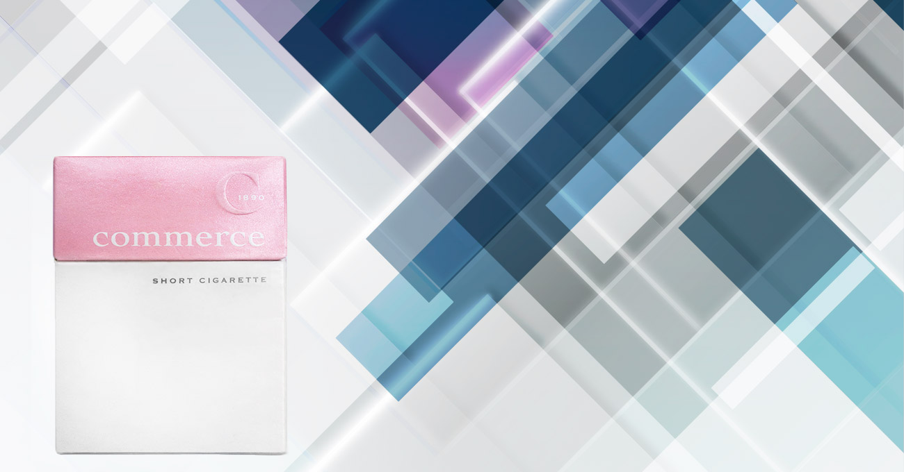
Package Design
Japan Tobacco International (JTI)
Young, naive and thoughtless, I, in 2002, was commissioned to design a new cigarette package for Japan Tobacco (JTI), one of the world's largest tobacco manufacturers. This is the only project in my career I regret having done!
On the one side, I feel very proud that it was me in my young twenties JTI asked to design the new Commerce package after their agency, which at that time was one of the world's largest, was not able to deliver a design they were happy with. I am, however, extremely embarrassed for having worked with a tobacco company and to make one thing very clear: if you work in the tobacco industry, don't even bother to contact me for work. I don't smoke, and I have no ambition to help any company design products that kill people!
This project, however, taught me a lot about working with design for products targeting global markets and how to work with legislators in the design process. I also learned how to work successfully with stakeholders from more than one country and with different cultural backgrounds and design preferences.
Krogfoto
Co-founder
2004 - 2009
Krogfoto was a Swedish advertising agency for restaurants which I co-founded in 2005 and were I acted as the Creative Director and lead photographer for five years.

LES ENFANTS TERRIBLES (LET)
Publisher & Editor-In-Chief | 2003-2005
As the editor-in-chief of LET, my goal was to create an easy accessible politically independent lifestyle and news magazine that would appeal audiences that normally wouldn't read articles about politics.
With LET we worked hard to present serious, challenging topics in a way that our readers would find accessible and engaging. As an example, we did a feature on street fashion in Paris during the riots where the street models provided their insights and commentary on the situation, something we repeated in Lebanon just before the 2006 war.
Download a copy of the magazine here »

Sunday Magazine
Founder & Editor-In-Chief | 2002-2004
Sunday Magazine is the most comprehensive editorial project I’ve ever worked on.
In charge of daily operations, advertising, sales, marketing and art direction, I also worked with the editorial team producing photography and articles.
Japan Tobacco International acquired Sunday Magazine less than 12 months after it was launched. I remained editor-in-chief for another year.
Read a digital copy here »

Bon Magazine
Co-founder & Publisher;
1998-2001
Bon is a leading Scandinavian fashion magazine.
Co-founding the magazine in 1998, I was the publisher until 2001, responsible for daily operations and relations with key advertisers, including Gucci, Versace, Armani and Helmut Lang.
Bon was voted 'Magazine of the Year' in 2000, and the same year the magazine also was acquired by the world-renowned music producer Max Martin, most known for his work with artists like Britney Spears, Back Street Boys, Bon Jovi and Céline Dion.
Read a digital copy here »

Meny
Publisher & Editor-In-Chief | 2001-2005
Meny started in 1999 as a B2B magazine for the Scandinavian restaurant- and hotel industry. After I had become the editor-in-chief 2001 the magazine was re-launched as a consumer magazine distributed in magazine stands on Sweden's best restaurant.
With Meny my goal was to create a fun and accessible publication about food, restaurants and nightlife and when I left 2004 Meny was the leading restaurant magazine in Scandinavia.
Download a copy here »